A Vision
War and armed conflict are never isolated events. They are reactions to circumstances that stem from a variety of factors like a region's history, politics, and culture. But in the recent years, data collection has made tracking trends in armed conflict easier, and data visualization has become a key solution to getting closer to understanding what patterns dictate the nature of war. Our vision is to supply researchers and politicians with relevant, readable, and insightful data graphics to further their exploration in armed conflict analysis.
About
In collaboration with the Infoseeking Lab at Rutgers University and the United Nations, ACAP is a data visualization platform created to revolutionize how we look at data pertaining to global armed conflict. Our clean, interactive visuals bring real-time data in formats that open the door to endless research explorations, conscientious diplomatic endeavors, and growing educational opportunities in understanding violent conflict patterns across the world.
Layered Choropleth Maps
Compare frequency of armed conflicts with national indexes like GDP and education rate to see if there is a correlation between the two on the map.
ROC Graphs
For correlation analysis and/or trend prediction, refer to Rate-of-Change charts that compare ROC's of indexes in various countries.
Reliable Information
The backbone of any project is always accurate and trustworthy data, and ACAP only uses reputable sources in data collection, all of which will be listed for the user's reference.
Our Journey
It all started with a group of students that wanted to use what they knew to create something different. Something that transcended the world of databases and code and could potentially change the way we see trends in worldwide phenomena.
-

Fall 2016
A Beginning
In 2016, InfoSeeking Lab students began a draft for a report that outlined the trends between armed conflicts in the Middle East in the efforts to predict how future conflicts would pan out.
-

Summer 2017
Starting from Scratch
Picking up a year old report outline created within the same lab, five students at the InfoSeeking Lab at Rutgers revamped the these to sketch out an idea for a full-scale database that could allow diplomats, historians, and politicians to draw their own conclusions about what factors affect war. After carefully discussing what features would be most useful to people conducting research as well as studying what other databases were lacking, the students knew their idea was something worth pursuing. In Late July, the team visited the UN and introduced their idea to the Data Analytics branch, and from there, ACAP was born.
-

Summer 2017
Pivoting to a Side Project
The Kenyan general elections were scheduled to be held early August 2017, and many government and humanitarian agencies, including the United Nations, were trying to anticipate the liklihood for the elections to result in large-scale violence. So when the UN reached out to ICT4SD collaborating universities to assist them with the project, the ACAP team conducted independent research and data analytics to create a report outlining the results it found.
-

Fall 2017
Bringing ACAP to Life
With the green light from the UN, the ACAP team is currently in the process of coding the collected data into a user-friendly interface. Progress can be track through our Github, where team members store all our data and platform code. In addition to computer science work, the ACAP team is also in the process of conducting historical research to give users more background on the trends our maps show.
-
And the
story
continues...
Our Work
It's all about layering-- no one condition or circumstance in a region is isolated, so bring able to visualize and compare variables together is the core of what we do.
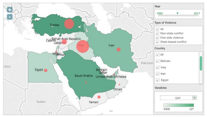
Choropleth Maps
A user can choose from a variety of variables, such as GDP, poverty rates, or education rates, and see them visualized by region as a color coded map. On top of that, the map shows the frequency of armed conflict in the regions to allow the user to find and support patterns between these variables and the commonality of war.
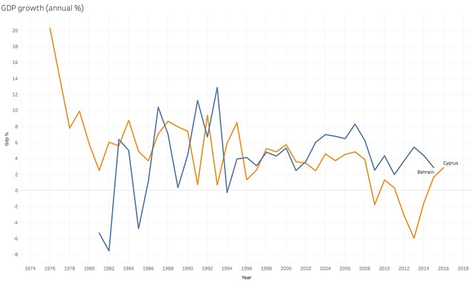
Rate-of-Change Graphs
Choose to see these variables in a more numeric fashion by analyzing rate-of-change charts. Lay multiple graphs side by side to detect or predict trends.
Check out our partially dynamic prototype to get an idea for how we bring multi-variable analysis to the user.
Our Amazing Team
“There's nothing we can't do if we work hard, never sleep, and shirk all other responsibilities in our lives.." - Leslie Knope from Parks and Recreation

Jhanvi Virani
Jhanvi Virani is an undergraduate student at the Honors College at Rutgers University- New Brunswick. Currently pursuing majors in History and Computer Science, she enjoys extracurricular activities like being a part of the Rutgers Entrepreneurial Society, writing a hip-hop column for The Daily Targum, and working as a research assistant.

Fancy Arora
Fancy is a graduate student at Rutgers studying information technology. He worked for 4 years as Software Engineer in Fixed Income valuation at BNP Paribas ISPL in the Corporate and Investment Banking Department. He enjoys expanding his skillset and exploring the fields of Software Engineering.

Nrithya Bhavan
Nrithya is an aspiring Data Analyst, and is currently enrolled in the Master of Information program at Rutgers University, with a concentration in data science. She was previously worked for Tata Consultancy Services Ltd., India, as a System Engineer. There she was the team lead for the Operations and Business Support Systems Lab, which focused on providing Enterprise solutions for Telecom Service Providers.
Chirag Shah
Chirag Shah is an Associate Professor of Information and Computer Science at Rutgers University. He directs the Center for Data Science and Social Systems (CDS3) and the InfoSeeking Lab. When he is not doing Data Science or Information/Computer Science stuff, he likes to go camping, hiking, and ballroom dancing.
Past Team Members
Niranjana Ganesh
Niranjana Ganesh is an undergraduate honors student in the Rutgers School of Engineering. She is double majoring in computer science and computer engineering. Her extracurricular pursuits include Enactus, singing, and Sanskrit.
Rajvi Mehta
Rajvi Mehta is an undergraduate student at Rutgers University - New Brunswick majoring in Computer Science and Math. She is involved with the Rutgers Mobile App Development Club (RuMAD) and the Rutgers Veg Society. In her free time, she like to run, sing, and play the piano.
Wei Shi
Wei Shi is a masters student graduate from Rutgers University where she majored in Information with a concentration on data science. Before graduating in August, Wei worked as a research assistant in the Info seeking lab. With strong interests on data science and marketing, she is seeking opportunities in marketing research and analysis. In her spare time, Wei enjoys jogging, yoga and photography.
Twisha Ajwani
Twisha Ajwani is a graduate student at Rutgers Business School concentrating in Data Analytics. Passionate about deriving insights out of huge chunks of data and aiding strategic level business planning, she has significant research expertise in statistics, business forecasting, data visualisation and highly developed quantitative and mathematical skills. She will graduate in December 2017. During her free time, she enjoys reading books and doing yoga.

Soumik Mandal
Soumik is a PhD student in the department of Library and Information Science in the School of Communication and Information, Rutgers -New Brunswick. His research interests involve information retrieval, computational linguistics and data science. In his spare time, he enjoys cycling, swimming and photography.